The Collective
An online streaming platform for e-gaming.
case study •
00:28
About project.
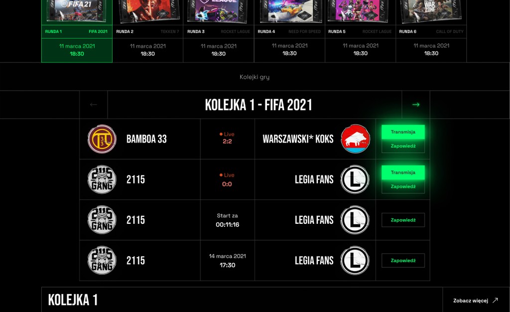
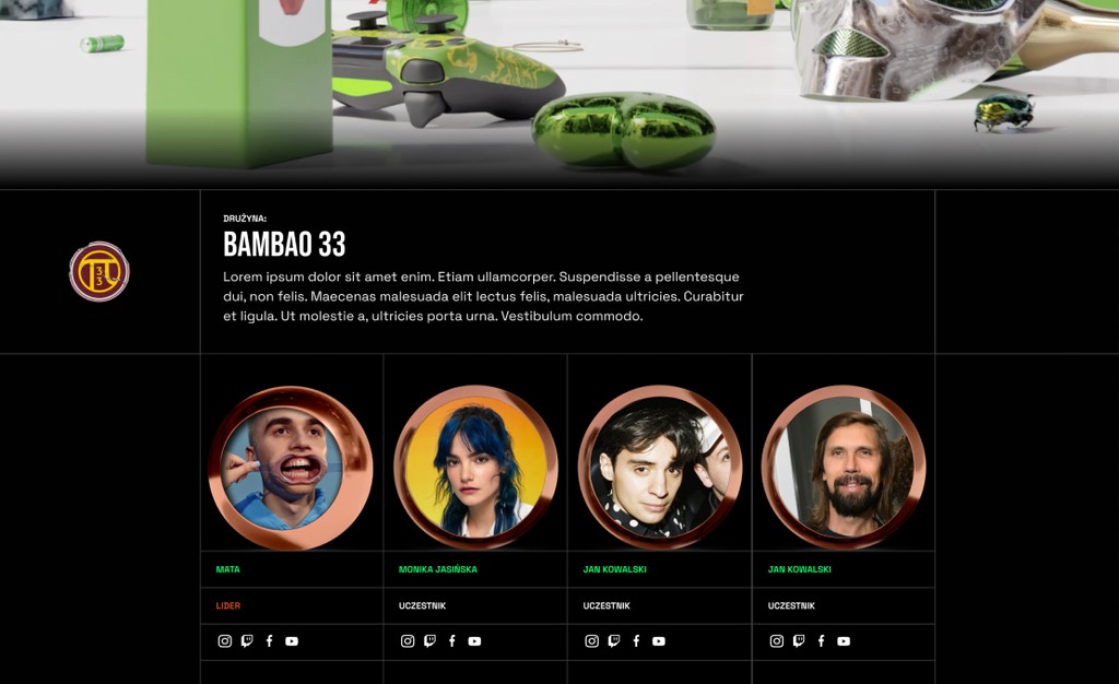
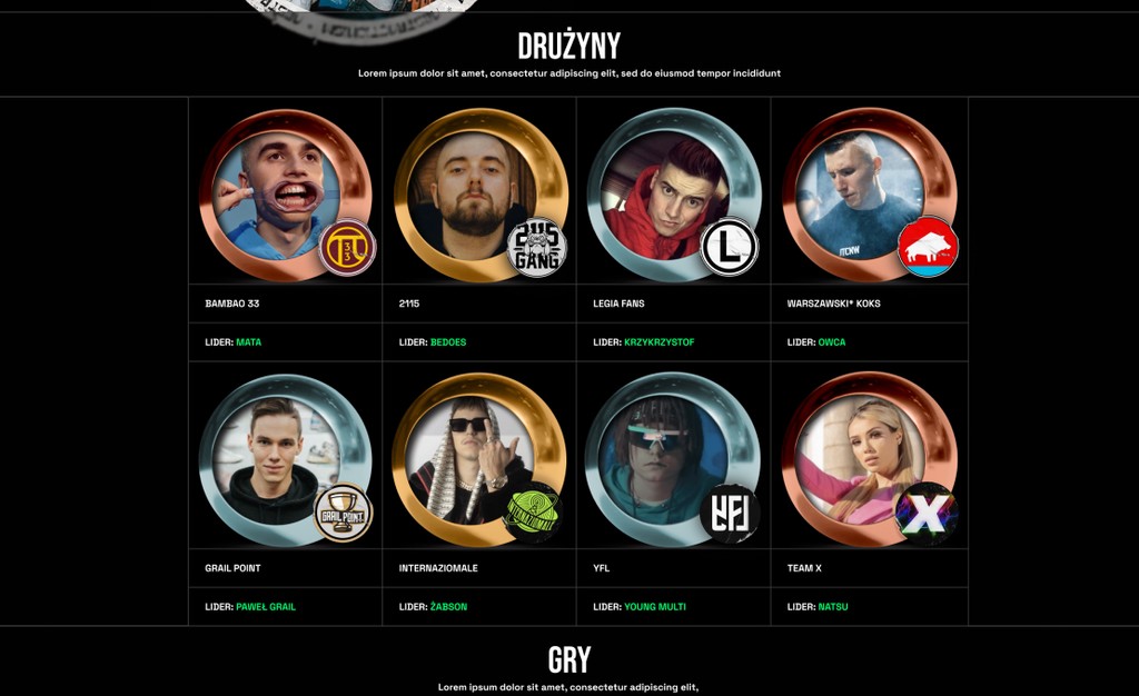
Web design for an online streaming platform. Together with Hero.dot software company, I designed The Collective - an online gaming gameplay platform. An incredible joint project by Dariusz Mioduski and Paweł Sabarański from Grail Point. The Collective is not a platform to present online games but a place to connect people from the Polish music industry, e-gaming, and Legia football player fans!
Product Design.
It was so great to design this website because I had complete control over the user interface style. Okay... maybe not entirely "feel free to do whatever you want" because I had to design the new website based on the branding by Ludvig Holmen (he's the best 3D artist I know - he really helped us with the logo and motion design for the Collective!).
I designed all wireframes in Figma (which is obvious) in close contact with my client, and after approval, delivered them quickly to the frontend and backend teams from Hero.dot who developed the website.
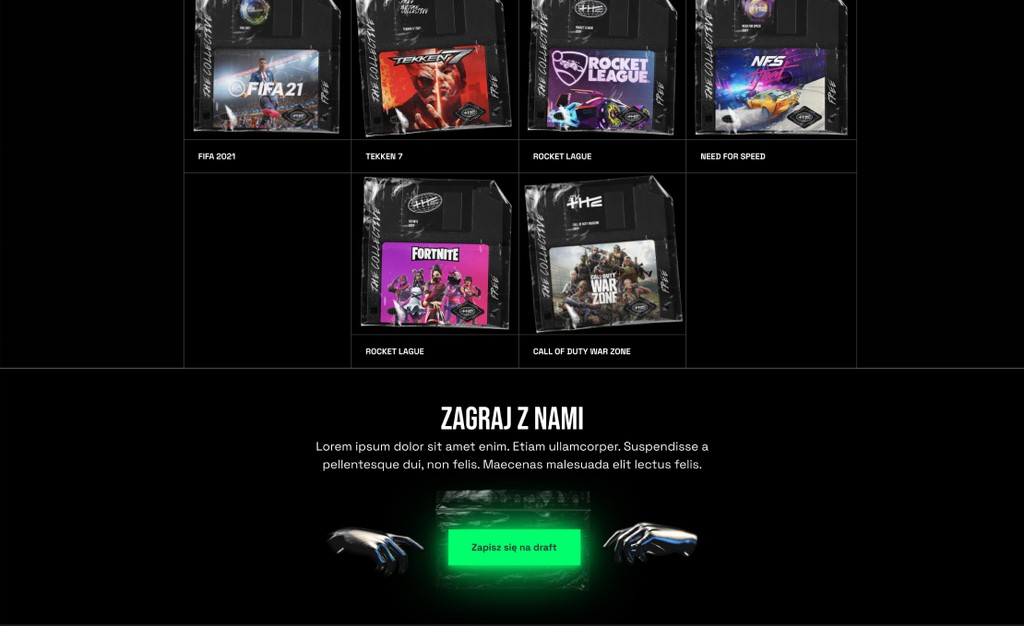
Click on the ticker to see some screenshots from Figma.
Design system.
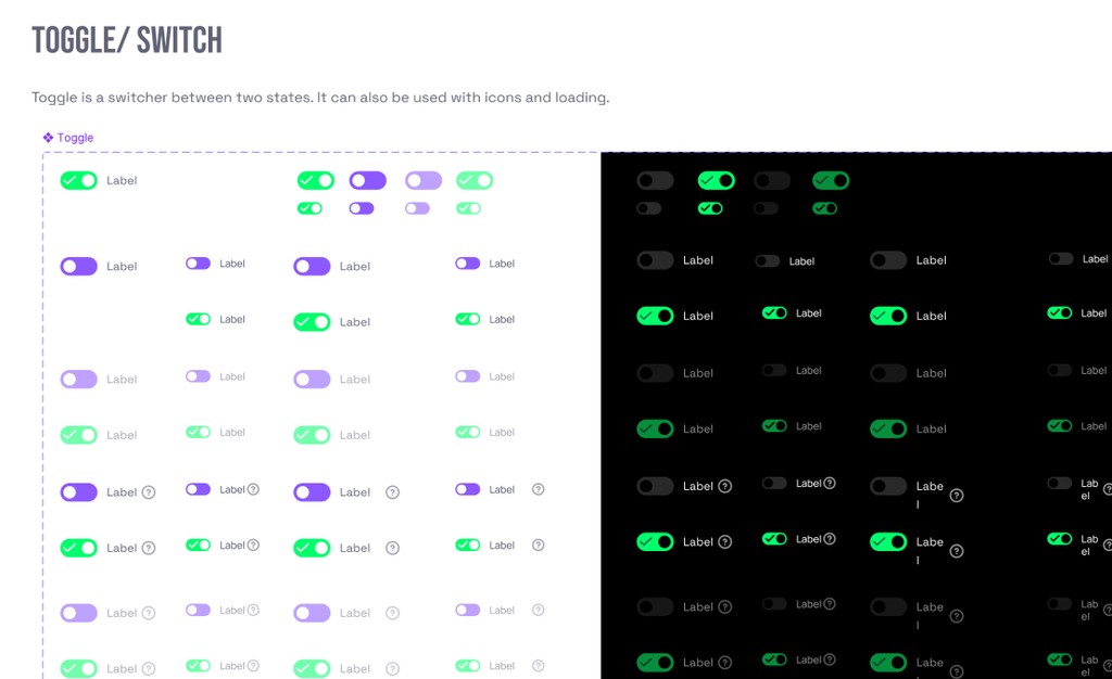
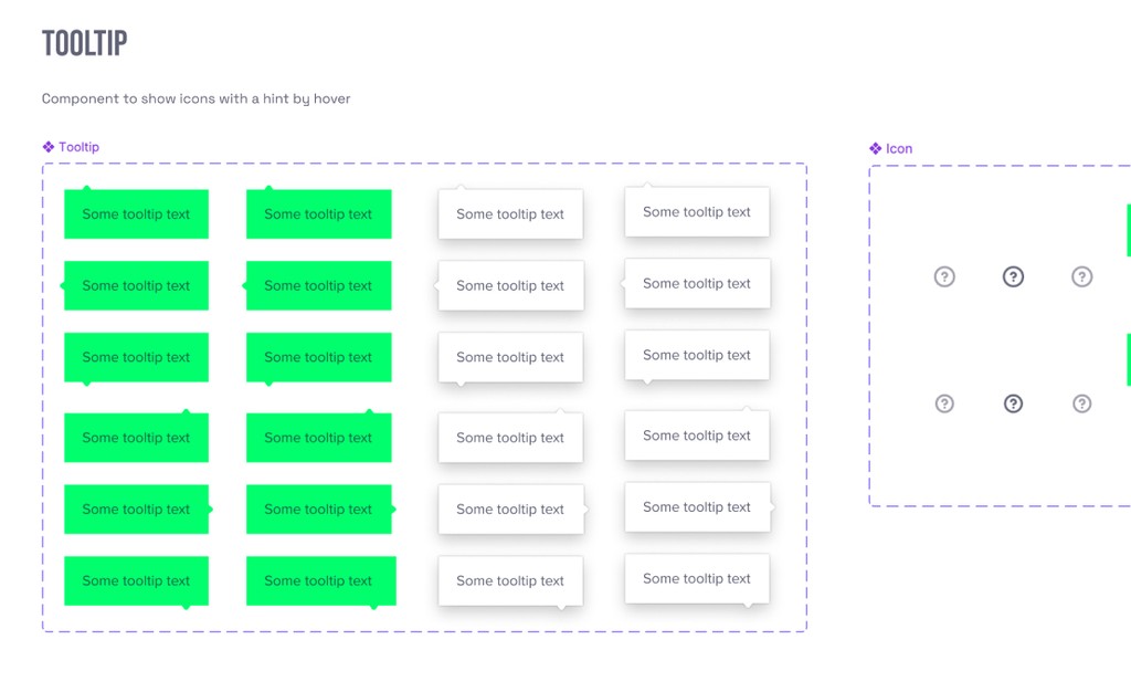
I always start all design projects with a simple websiste' style guide, but if some websites are more complex, a separate design system file is a must-have for me! For this project, I designed a separate design file in Figma based on the Taiga UI component library.
Thanks to this solution, I was able to quickly design all wireframes for my client, and my work with the frontend development team was more efficient! All design in Figma that I used to build the app were based on the design system with external links to Angular frontend library components. This was very helpful to my colleagues on the frontend team, as it assisted them in styling components such as buttons, toggles, and switches.
Click on the ticker to see more screenshots from the design system file for The collective.
Graphic Design
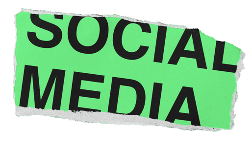
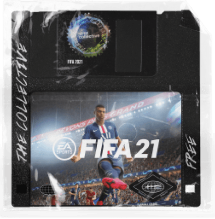
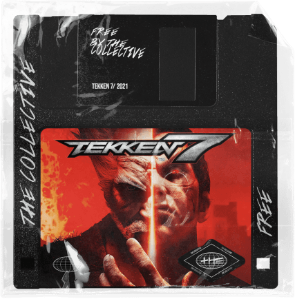
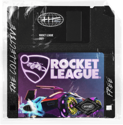
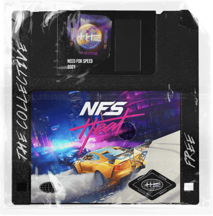
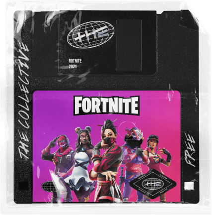
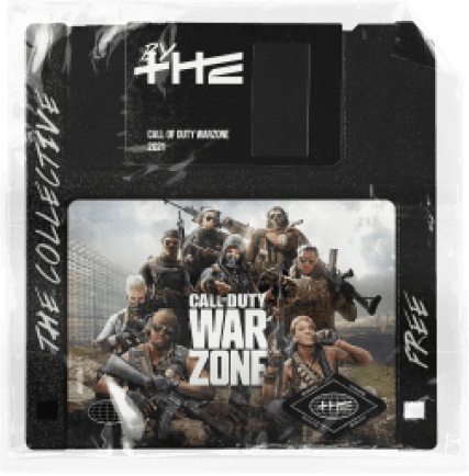
The User Interface is not just buttons, text fields, or menus... but also includes many bitmaps—small graphic designs that help build "that feeling." (Many of us probably remember the beginning of the Internet with fancy .gif/.png files to build "that specific brand feeling." Yes! I still love the 2000s website style, and I still love to use custom gRaPhiicS.)
While building the Design System, I created a lot of additional 3D or static graphics to improve the User Interface of the website. For example, I designed headings with custom PNGs or graphics to engage users and encourage them to click on the CTA (call to action) button.
Motion Design
As many videos and 3D renders were made by Ludvig Holmen for use in social media campaigns, the website app needed something extra. (The website is a completely different platform and needed a totally different approach, as you know.) To build the User Interface, I designed some extra motion designs to engage users in the new app.
All of these interactions, such as text animations and interactions on button hover, were entirely new designs by me but still maintained the same voice and feeling from the collective's branding.
