vibez.pl
Product design of media platform.
Product Design of Vibez.pl in collaboration wit Google Digital News Innovation Fund and WP Media. Vibez.pl is one of Generation Z’s most popular news websites on the Polish market.
About client
WP Media to jedna z największych spółek Wirtualna Polska Holding. WPH is one of the largest Polish Internet media and e-commerce companies, is listed on the Warsaw Stock Exchange.
In WP Media, I worked as a User Experience Designer whose responsibility was developing publishing services and designing new products to gradually expand the company’s portfolio of digital products in the Polish market.

Vibez.pl is a website that I have developed in collaboration with WP Media and Google as part of the Google Digital News Initiative. The Digital News Initiative is a European organisation created by Google to support innovative publishing projects. The vibez.pl project is the only such publishing initiative in the eastern part of Europe which has been qualified in the category of large projects with a budget of 300,000 to one million euros of funding!
Check the full description of the project on the Google website!
About project
Vibez is a new publishing project addressed mainly to young readers in Poland – Millennials and Generation Z. Young people, unlike older generations, get information on the Internet. Vibez.pl is an innovative response to the changing increase in content consumption among young people. Nowadays, journalism should be dynamic. Vibez.pl is a website that gives new information in a condensed way in a short time.
Vibez.pl is a project where young readers consume information using “tap”, “swipe”, “skip”, and “skim-reading”. It is a media service where the image plays the primary role of presenting information instead of written text. This is a website that radically changes the traditional news format. It is vertical in a structure washingtonpost.com or theguardian.com. On vibez.pl website, the user can “swap” in any direction.
Vibez.pl is a highly innovative product in terms of information presentation. It was designed to change journalism for young people in Poland and allow them to leave the bubble of social networking platforms.
Vibez.pl is also one of the few websites in Poland using the Web Stories by Google!
Team
I had the opportunity to complete this project while working as a UX Designer in the Product Design team at Wirtualna Polska Media. Designing the Vibez.pl website took over 2 years and was completed thanks to the iterative work of many UX and UI designers.
Each designer’s work involved continuous improvement of subsequent versions of the project where the basis for changes was the results of research with end-users. Remarkably, every change in the design was determined by the usability research results that we conducted with end-users!
As UX Designer, I had the opportunity to design the final version of the website together with the brilliant UI Designer Nataliia Voitanovych, who was responsible for the product’s visual style.
Prototypes research
Prototypes Versions
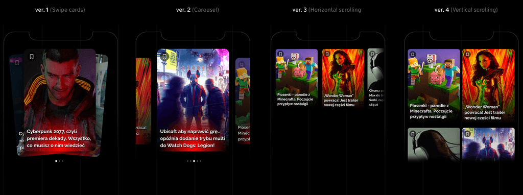
In the first stage of work, my team designed 3 versions of the article view. Each version featured a different form of navigation, e.g. swipe or scroll (horizontal and vertical), a different form of text and image presentation, and different functionalities.

1st prototype – the project created by an external company Autentika. The project featured card swiping and included functionality such as a table of contents.
2nd prototype – the project was created by the WP Product Design team. Navigation through the articles, as in the case of Autentika‘s solution, was characterised by left and right swiping. The user had to swipe through the tabs with photos and text to read the entire article.
3rd prototype – the version that combines several different navigation solutions. A young reader consumes an article using traditional “up and down” scrolling but can also swipe between articles.
4th prototype – the final version of the website, which I had the opportunity to design with Nataliia Voitanovych.
Usability research
A set of 3 prototypes was implemented on the homepage o wp.pl – one of Poland’s most popular media websites, which is visited every month by over 13 million Internet users.
Three versions of the prototypes were put into production and tested only for a selected group of users, i.e. Millennials and Generation Z. We obtained precious quantitative data that I used to design the subsequent versions of the website by testing the prototypes in a closed group of tens of thousands of young users.
Together with the research agency 4P research, we conducted in-depth interviews with a group of 26 respondents. Quantitative data is critical for knowing how users navigate the prototype, but qualitative data is extremely precious!
This is the best idea for me. I like it best when I can scroll the whole article from top to bottom and not swipe tabs. It is better to read such an article.
User 14 (from 24)
Thanks to one-to-one interviews, the research agency has prepared a detailed report for WP on disfavoured and favoured usability solutions. Want to check the entire research report? Check out the presentation below or click on the link.
Product Design
We conducted the entire project using Abstract and Sketch apps. The Abstract app was used to version our project, and the Sketch app was used to design all UX and UI mock-ups.
Below you will find the source files of the project. Maybe some of the usability solutions will be useful in your work. Go ahead and download the files! Sharing knowledge is important to me!
NIEEEEE MAAA
Functionalities
Through testing with end-users, I learned in detail about their expectations of news consumption and how they navigate the site to find information of interest. The user can navigate through articles in any form, e.g., swiping or scrolling from top to bottom; they can also scroll horizontally (from right to left). Below you will find four versions of the article sneak peek:
Emojis
Presenting a range of extreme emotions such as joy, laughter or nervousness in a simple graphic form is difficult. It’s no coincidence that Facebook is constantly testing reactions on its website. Even companies such as YouTube are testing time-specific emoji reactions. I designed several versions of emojis for vibez.pl, which I tested with users.
Thanks to quality tests, I was able to choose the version that best met the target group’s expectations:
Comments
A user on vibez.pl can comment on an article from any location. A user can add comments directly from the cover view of the article. As a designer, I wanted to involve users as much as possible in consuming content on the website.
Progress bar + share button
In Autentika‘s first prototype that I tested with users, the presentation of the time taken to read an article was quite overwhelming for users. In the case of a significant amount of time required to read an article, the user often gives up on exploring the news. If a user had to spend too much time reading the news, it discouraged them.
In the final version of the website, I designed a progress bar that informs the user where they are in the article and how many parts they have left to read. This is an excellent solution that increases user engagement in content consumption! Thanks to this solution, users are more motivated to read the whole article to the end rather than just a part of it.
Accordion component
The first versions of the prototypes we tested (you can check them below) proved to be of little use to the target group:
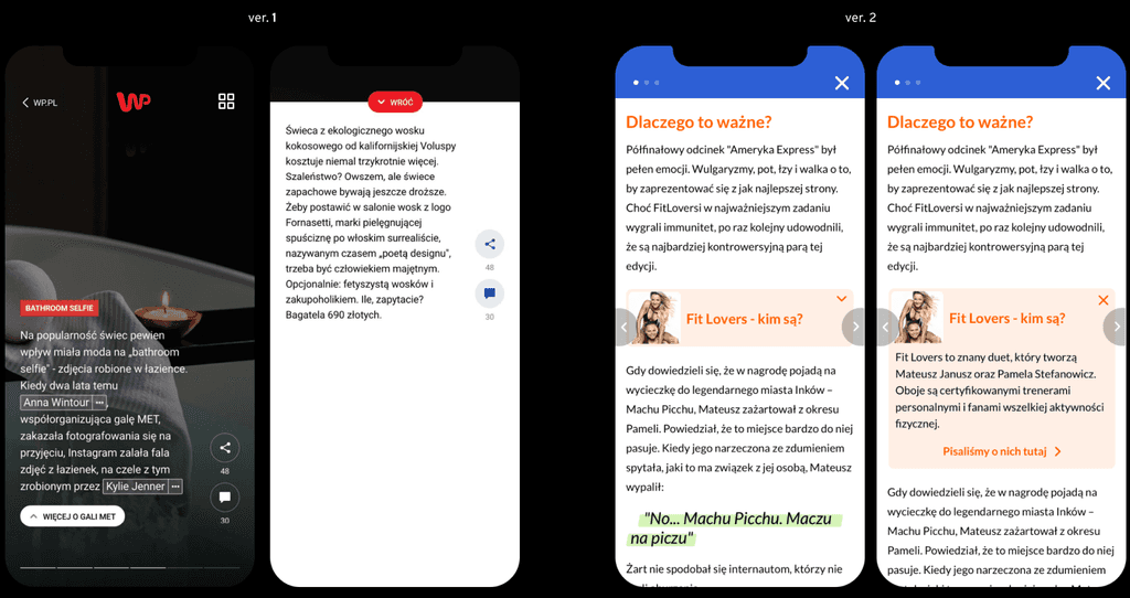
Thanks to the research report, I was able to design the final version of the functionality, which delighted the users:
Introduction on Navigation
When designing the site’s navigation, I was inspired by solutions from services for young users such as TikTok, Tinder and Instagram. Product design should include every age group, not just young internet users. To facilitate navigation for new users on the site, I designed a series of animations that informed users on how to browse the website:
Conclusion
Business impact
The implementation of the website for production increased the reach of Wirtualna Polska Media in the age group of 15-24. Thanks to a significant increase in the number of young users, the media company has improved its advertising potential among the young consumers of the Polish internet.
Mobile Trends Awards winner
The service brought significant financial benefits and was also recognised by the Mobile Trends Awards – the most prestigious competition in the technology industry in Poland. The vibez.pl has been announced the winner of the 2020 Mobile Trends Awards in the best mobile service category.
UX Research – Essential to Product Success
Working on designing a media website for a more specific group of users (Millennials and Generation Z) was an enormous challenge for me. Because of numerous qualitative and quantitative research, I was able to validate most of my design ideas! Thanks to usability research, quality tests, and A/B tests, I was able to learn the target group’s expectations to design a successful website!


